Website Research: Naked Wolf & Christian Louboutin
As we are creating our own website, I will study two websites and compare and contrast these. This website research will assist me in understanding how to create my own website so I will consider the overall design, colors, and typography, navigation, usability/user-friendliness, links and mobile view.
Beginning with Naked Wolf Website, I begin with seeing the homepage, where I find the home page is divided in only two picture and having two text Mens and Womens. After seeing the pictures I was quite disappointed cause the picture of mens and women are not matching the theme of the website. The home page did not had a footer or any text related to the website.
Next I clicked on Mens and found out that the page is very untidy and filled up with the pictures and no specific text content, Although the designs were great but the formation of page with only picture and only 2/3 text does not makes impact towards the viewer, instead leaving them clueless on where to see their work.
Bellow that I find out the the page had a footer which was decent and had all the information required, this could have been better if the fonts were big and the font type matches the other text used , Although allot of space was left blank .
The navigation bar was on top which was interesting cause all the required information was in it, but it would have been much better if the home page had some of the information instead of making disorganized.
I also checked if the social link work or not, where it worked properly.
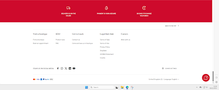
Secondly I started reviewing Christian Louboutin Website where I begin with the homepage, the Text the font and the page was made really well with proper information navigation bar and all sort of details on his work . the home page even had a footer was really well, also the red color in his website best describe his work for the outsoles .The home page had a nice welcome video with all sort of text directing the viewers easily to find out what they are searching for and appropriate additionally information like whats new .
Next, coming towards Footer which was a great work I sneaked into every page where I found out the footer was available in each and every page connected to the website, and the additional information was also presented properly.
Next I searched for About us page where I it was named as Louboutinworld which shows us a good brief on the work done by the designer and proper background information. Also I checked all the social links for instagram and twitter which worked properly and checked the contact us page.
Lastly I checked each and everything on mobile phone where I felt the website on desktop is better than phone perspective because everything was looking good but not that effective like desktop point of view.
Comparing both the sites, the first one Naked Wolf Website was not that effective and the website was only of pictures and few text, not only but also , the navigation bar was good but wasn’t that effective cause all required and unnecessary information and tabs were there all together. On the other hand Christian Louboutin website was very good it made impact towards the viewers, the navigation bar was well organized the background theme with the pictures and color was working perfectly. The Naked work website didn’t had a footer on the home page but in different sessions there was a footer, while in other website the footer was available on every page. Secondly, both page didn’t had copyrights tag on the footer.Thirdly, I checked every social links and about us and contact us page where I felt Christian Louboutin Website is eventually better than the Naked Wolf Website.
Lastly, I did proper research on the mobile perspective of each of them where I found out that the naked wolf website on cell phone was looking better than desktop and vise versa, Christian Louboutin website was better on desktop point of view than the mobile edition.
After completing my review, I understood both mobile and desktop website needs to be made properly to have a friendly interface towards the viewer where I need to have proper footer and navigating bar giving the simply and easy interface to head towards what’s my viewer wants to see rather than making it complicated and confusing before I publish my website. This was a good practice where I got to know and learn about new things in website aspects and how it can make my workspace presentation better for my target market and viewers.


Good that you contrasted and compared I do think you could have added more than 'I learnt new things' and been more specific about what you can you use in your own website design
ReplyDelete